ReStore Logo & Packaging Design
ReStore Natural Fertiliser came to us in a squeeze – just days away from product launch in a highly competitive sector competing against chemical-based competitors, with a tired logo and packaging design the simply blended in with the competition.
Their design team had followed industry norms, with art direction in line with competitors. We needed to break from the norm and help them stand out in a crowded marketplace.
Art Direction
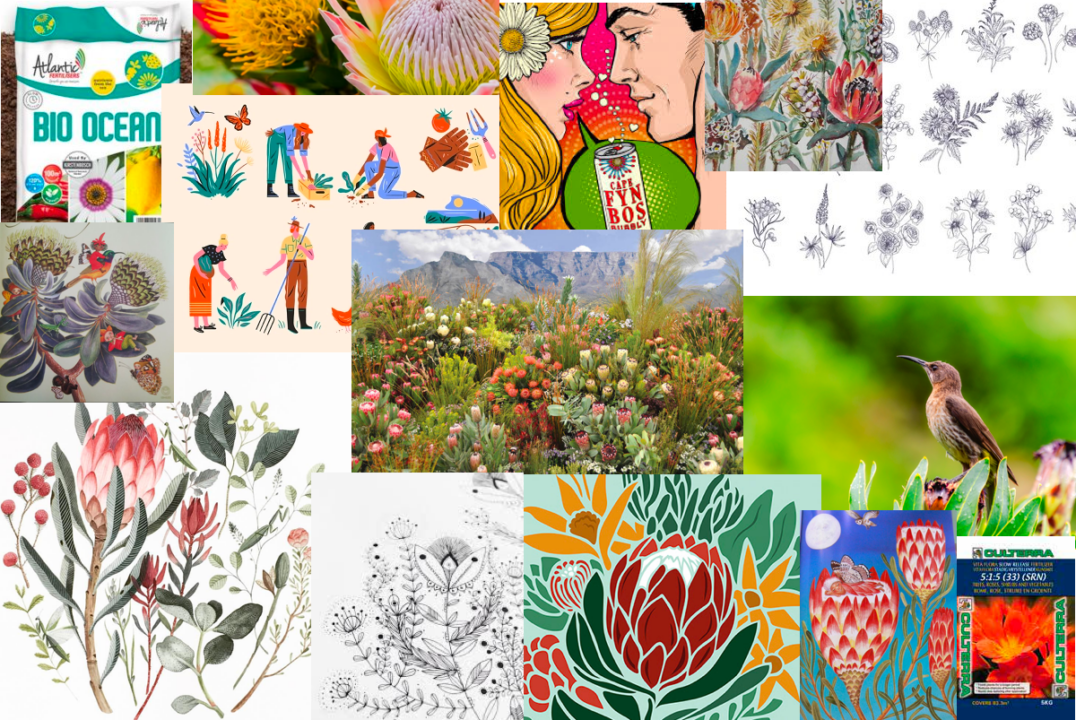
Art Direction 101: we started with a mood board to build out an understanding of the client brand identity internally, to understand their target audience and how they wanted to position the brand.
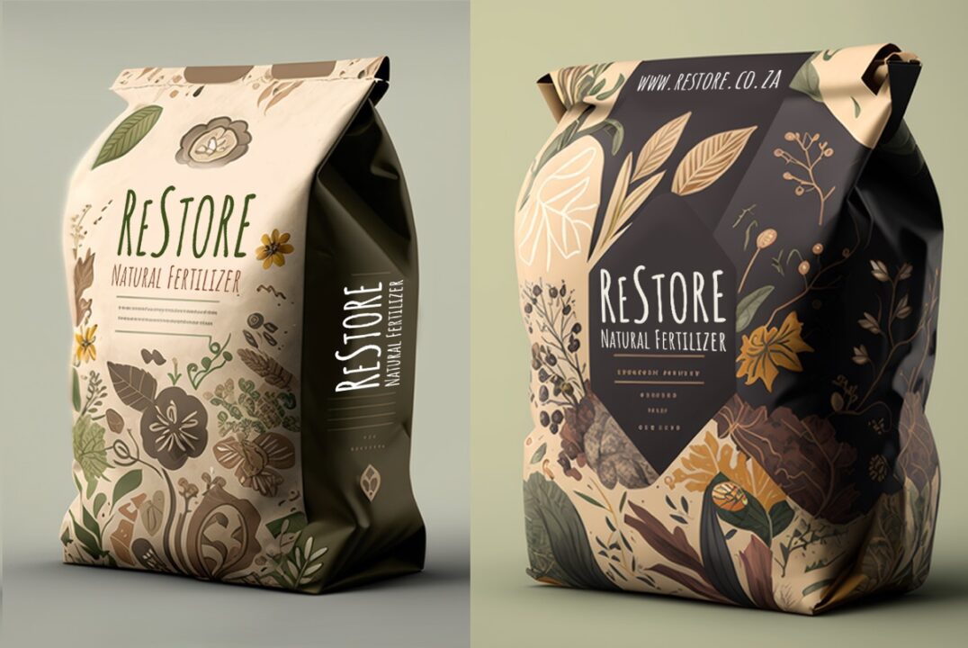
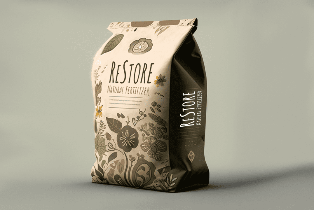
Packaging Design & Mockups
Building from our mood board we built out a design language that spoke to the Cape Town roots of the product, with native “fynbos” vegetation and an illustrated organic style.
We built two final mockups for the client, with immediate client sign off on the first design – they loved it!
Bringing it all together
From Art Direction to Graphic Design and Mockups…
Overview
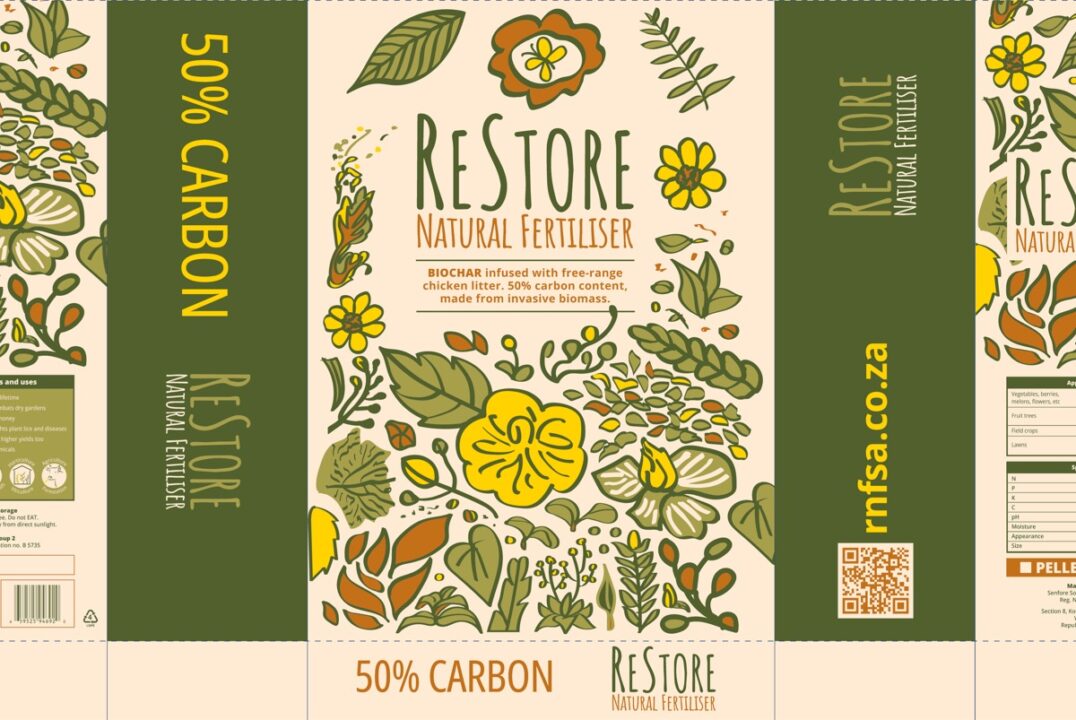
Logo redesign and packaging design mockups approved, our design team were tasked with the nitty gritty – translating our design to a 4 colour base and building out flat design for printing to printer spec, final design can be seen below. ReStore were blown away!
We are honoured to be a part of building out a CI and product packaging for a customer aiming to build a better, more sustainable future.
CLIENT:
ReStore
YEAR:
2023
WEBSITE: